How to Use Design to Improve Your Online Store’s Brand

Design is to business what evolution is to nature: it allows brands to change and survive. When operating an online store, the virtual look and feel of your business are the only things that potential customers have to go on to make up their mind about whether to spend their money with you or not.
And as the digital revolution has brought with it shorter attention spans and expanding touchpoints, the need for great design has never been more important.
Most businesses are already taking advantage of design techniques to help consumers in today’s always-on world, with streamlined experiences and simplified messages.
But sometimes simplification isn’t enough - design needs to create space for seduction, surprise and delight.
Unsure what we mean by that? Let’s take Apple as an example. The tech firm uses design which embraces simplicity in order to find ways to stimulate the senses. Similarly, Google keeps things uncluttered, yet manages to engage users with its fun daily graphic around the search box.
It’s these techniques that consumers become seduced by and what’s sets these brands aside from their competitors.
But you already knew that.
That’s why you chose a sleek website template and invested in quality product photography. You already have a memorable logo and your emails have a professional template.
So, else could you be doing? Here’s three creative branding tips that will make your customers remember you…
1. Create your ‘Brand Bible’ and don’t let go of it
Consistency is not just something reserved for fitness gurus. It’s also really important to marketers.
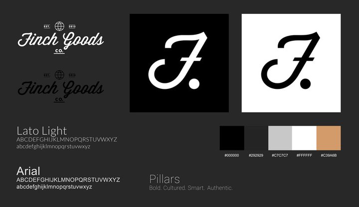
A brand bible, or style guides, is a document that captures all the necessary information to create whatever your company needs.
It’s a toolbox containing your logo, typography, colours, writing style, photography style and more -a real lifesaver when it comes to creating new materials.
Best of all, it should be possible for anyone in the company to use and create consistent branding material.
They take time and effort to create, but making one could save you wasting energy further along the line.
Here’s just some of the basic things you should include in your brand bible:
- Logo: Size, background, where it should be placed and how it should - and should not - be used
- Typography: Font size, kerning, leading and the uses for each different font you may use
- Color palette: Primary, secondary and alternate colours, plus exact hex codes and CMYK/RGB values
- Imagery: Give a distinct feel of the style of photography and the main principles you want to convey; list the types of mood, people and locations, as well as any image size specs
- Brand voice: List particular words of phrases that should always appear - and any that shouldn’t

2. Design a unique packaging experience
“Don’t judge a book by its cover?” Oh, but we do!
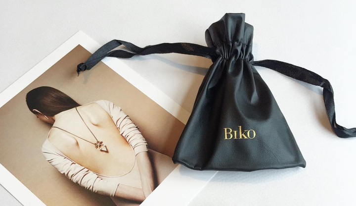
Beautifully designed and clever packaging is, in some cases, just as awesome as what’s inside the box.
Not only can it help market your product, but also leave a memorable impression with consumers - making them want to repurchase and building brand loyalty.

If you have any doubts about your branding strategy, coming up with some innovative and quirky packaging could be a great way of making a name for yourself.
How about making your packages fit through the letterbox? That’s sure to get customers talking...
Whatever you do, make sure it’s consistent. Take a look at Coca-Cola. They have made very few changes to their packaging over the years and stayed true to their original look - making them easily recognizable.
And remember, don’t try to overcomplicate it. Sometimes minimal packaging can make more of a lasting impression (think Apple, Google, Ikea, etc.) They remain timeless and it keeps it much easier to make design tweaks when trends change.
3. Keep everything consistent
Brand perception is the result of the consumer’s experience with the brand. It’s like putting a face to a name.
When you think of the world’s best known brands you can instantly picture their logo, color schemes and maybe even recall their slogan, instantly in your mind.
These companies didn’t just stumble across the things that make people identify them. A lot of work will have gone into each aspect of their development, especially the overall design.
It’s usually because they’ve remained consistent. Doing so can help build your brand’s success - and your customers will be none the wiser.
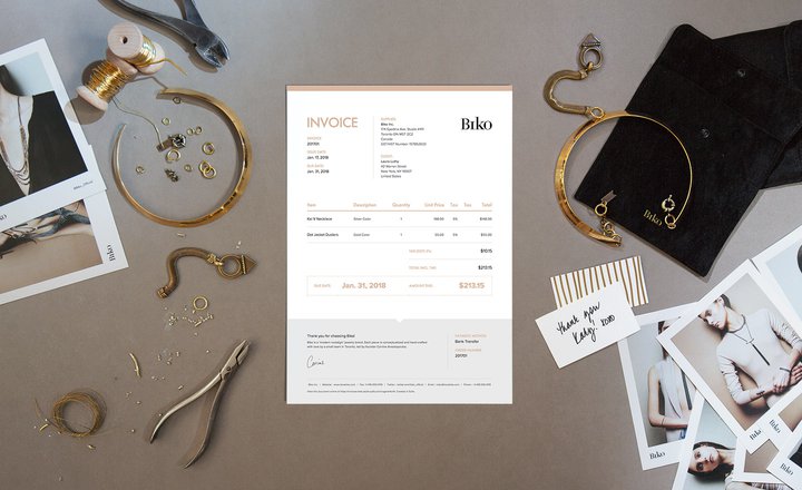
Many businesses are great at ensuring brand consistency across their website and packaging, but they miss the little things like invoices, quotes and delivery notes. Make it an entirely wholesome experience with beautifully designed invoice templates that match your branding to create a good impression whilst also promoting your company.
Sufio is the first app for Shopify stores that merges invoices with beautiful print design. Sufio has teamed up with top-notch print designers who have created five amazing invoice templates for you to customize and match with your brand.
Professional invoices for Shopify stores
Let Sufio automatically create and send beautiful invoices for every order in your store.
Install Sufio - Automatic Invoices from the Shopify App Store