5 Creative Cosmetic Packaging Designs
Most people who wear make-up will probably tell you that they wouldn’t go to the effort - or expense - of putting it on their face if it wasn’t going to be seen by anyone else.
The packaging is the first thing a customer will see before they even get the chance to try, smell or feel the product. For beauty die-hards, the way a lipstick or a mascara looks is arguably more important than the cosmetic itself.
In fact, 33% of consumers said that they are more likely to reject a product or brand if they don’t like the look of the label, according to a 2017 survey by Luminer.
Social media also has a big part to play with the rise of influencers and unboxing experiences carving new marketing and sales channels that act as virtual product displays.
Take Kylie Jenner as an example - the Instagram star’s cosmetics company Kylie Cosmetics has reportedly made $420 million in retail sales in just 18 months and her first product, Kylie Lip Kits, sold out within a minute.
Yet, the products are sold exclusively online, which means consumers hadn’t even had the opportunity to sample the product before purchasing, proving the power of social media.
In such a noisy and fast-paced industry, it’s clear that packaging should be treated with as much importance as the product inside.
To help give you some inspiration, here are some brands which we think are already doing beauty packaging beautifully…
SOFI Cosmetics
Cosmetic brand SOFI is a family business based in Serbia which specializes in handmade, high-quality products made using natural ingredients.
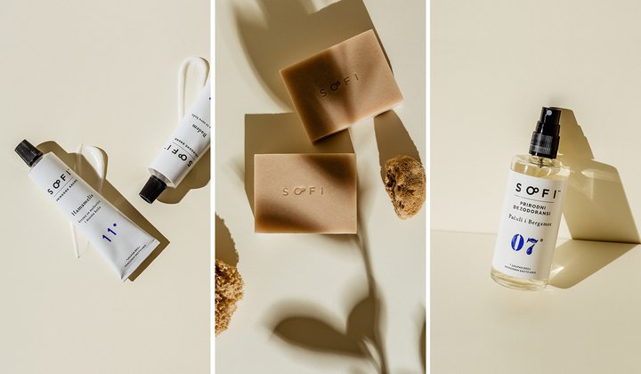
Products include natural soaps, bath bombs, lip balms, fragrant salt baths, face and hand creams and body oils.
Their packaging is simple, yet elegant, and uses botanical drawings to clearly convey the brand’s message of relying on “the power of plants” and “respect the environment”.
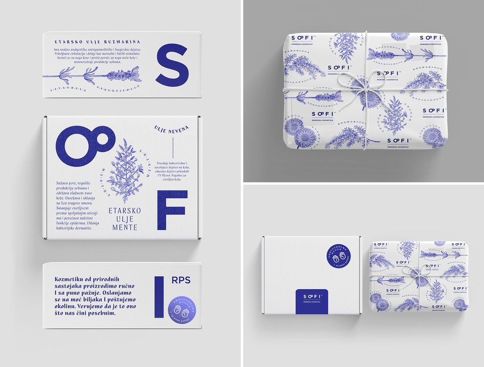
It was designed by a local art director, Milica Pantelić, who is based in Belgrade and said it was no surprise that the brand chose design strategies as the way to promote their brand, rather than marketing.
Writing about the project on her website, she explained: “I developed and designed a new experience design project which involves packaging design that communicates core brand values – Uniqueness, quality ingredients, sustainability and contemporary presence.
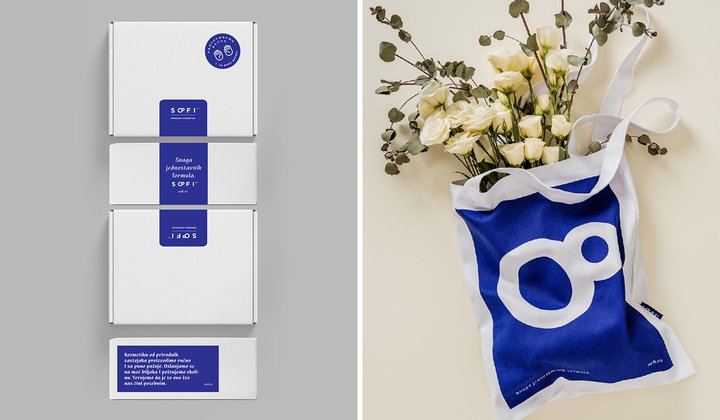
“These values are communicated throughout diverse brand touch-points utilizing different senses.
“Touch sensations through fine materials, pleasant fragrances deriving from products inside the boxes, and a sense of aesthetics aroused by contemporary and minimalist design.”
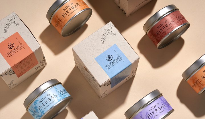
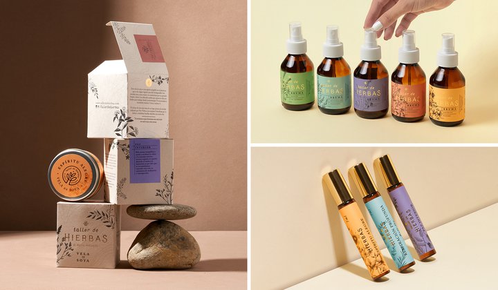
Taller de Hierbas
In nature, nothing is perfect but it is beautiful - a sentiment very much at the core of Taller de Hierbas, right from the products they produce to their packaging.
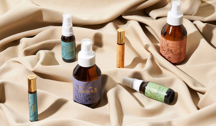
The family-owned brand produces skincare and wellness products out of herbs and different natural ingredients in El Retiro - a small town east of Antioquia, Colombia.
With that in mind, their brand design uses a more natural and subdued color palette to represent the natural ingredients contained inside, while the singular line logo conveys the sense that in nature, everything is connected.
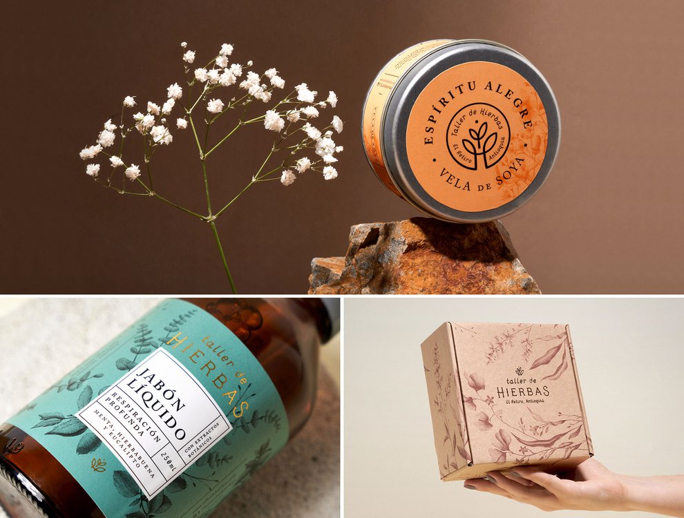
The botanical illustrations on the labels represent the herbs used inside, but best of all, no two products use the same color either - just like everything in nature.
Their beautiful packaging was designed by Invade, a branding studio based in Medellín, Colombia.
Carlos Restrepo, one of the designers, told us: “A herbal inspired the design, a book where one collects flowers and leaves to preserve them. Of course, they dry and change their appearance. We wanted to show how time changes them, but at the same time, they conserve their essence.
“’Cuerpo, Mente y Alma’ expresses how important it is to self-care to maintain your body and mind health.”
Explaining how they went about the design, he said: “Writing is always the first step. There is where all the ideas start to come up. Alchemy was the first thought. However, we dug deeper and realized that the brand needed to be more democratic and familiar.
“‘Tesoros de la Tierra para cuerpo, mente y alma’ appeared on the table to synthesize it all. The foil details in packaging also came up in the writing process.”
Asked whether they had been faced with any challenges during the design process, Carlos said that the main issue had been to put all products under the same graphic system.
“The goal was to optimize production and buyer experience. Imagine 20 or 30 products, each one with a different name... It was insane.
We created a color-coding, where the brand started to unify its products. The scope was now narrower and easier to achieve. This obstacle is now surpassed, and the brand has a defined route to follow.
”
And their proudest part? Well, that goes beyond the design, Carlos said.
“Taller de Hierbas is having success, and its sales are constantly increasing. That's our ultimate reward. We have created value for them, and they recognize it.”
He added: “From the beginning, Taller de Hierbas trusted in our criteria. They even supported us when we made a big mistake in printing.
“The relaunching was a big success; they passed from a local business to a countrywide wellness brand.”
1FLR
For some people, less is more - at least when it comes to sleek and contemporary design.
It’s something Paris-based design studio A&M Creative got right when they were asked to come up with the branding and packaging for Korean skincare brand 1FLR.
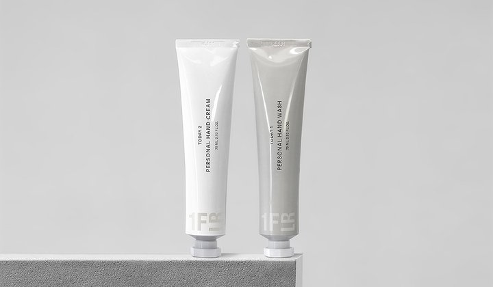
The premium beauty company provides luxury products, symbolized by the first floor of a department store, but sold at a reasonable price, by simplifying packaging and distribution.
Their range includes cleansers, toners and moisturizer, which would all look aesthetically-pleasing in any gloss white bathroom.
To speak to the urban minimalist the products are intended for, the designers stuck to a simple and clean color palette of whites, blacks and greys while the typography is blocky, sans-serif and bold.
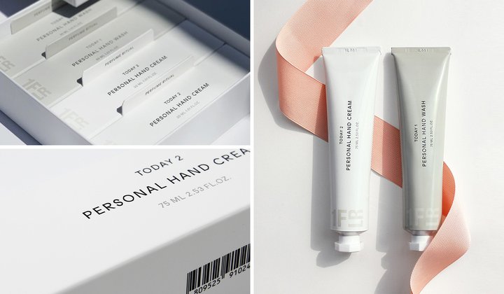
On their website, A&M Creative designers said: “1FLR creates functional beauty products for contemporary living.
“Reflecting 1FLR’s philosophy, ‘Committed to Essentials’, A&Mcreative designed a brand image with practical and rigorous aesthetics for the urban minimalist.
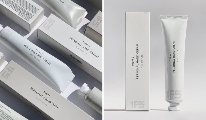
“The wordmark references architectural codes, combined with the soft sophistication of the color palette and the understated beauty of the typography.
“A design crafted with precision and simplicity for everyday life practical luxury products.”
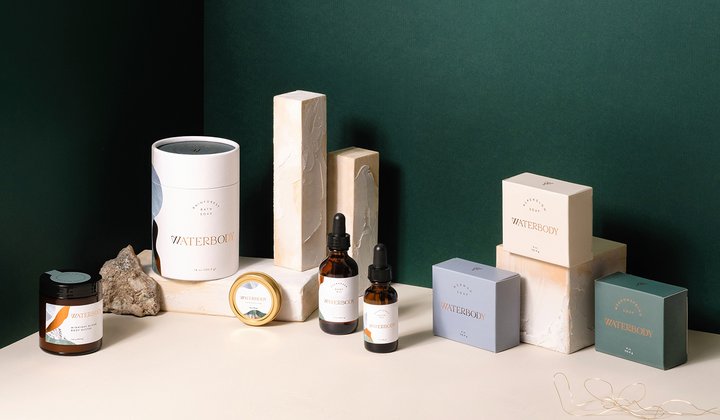
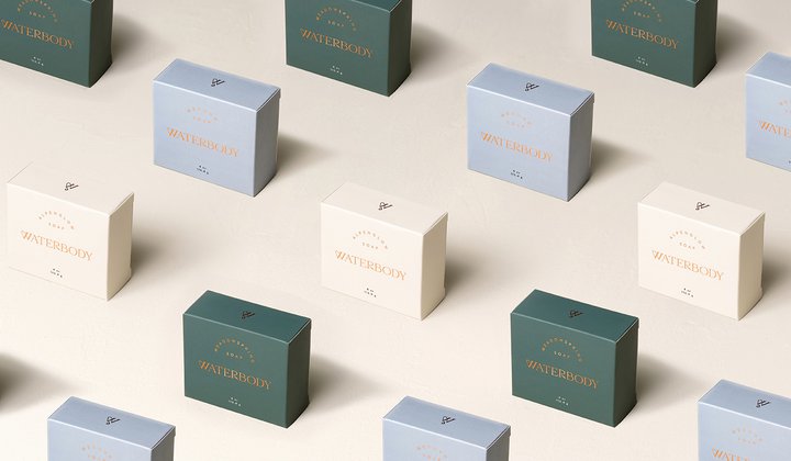
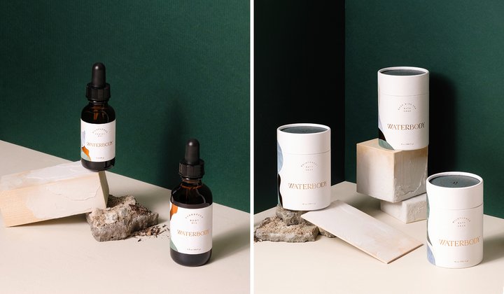
Waterbody
Waterbody is a skincare range inspired by the wilderness of Southeast Alaska - a landscape shaped and connected by water.
Products are formulated using completely natural ingredients harvested from the dense and mossy forest, boggy wet muskegs, and rocky barnacle-studded seashores of the local area.
It was something that founder Angie wanted to get across with her branding and packaging, so turned to LA-based designer Kati Forner.
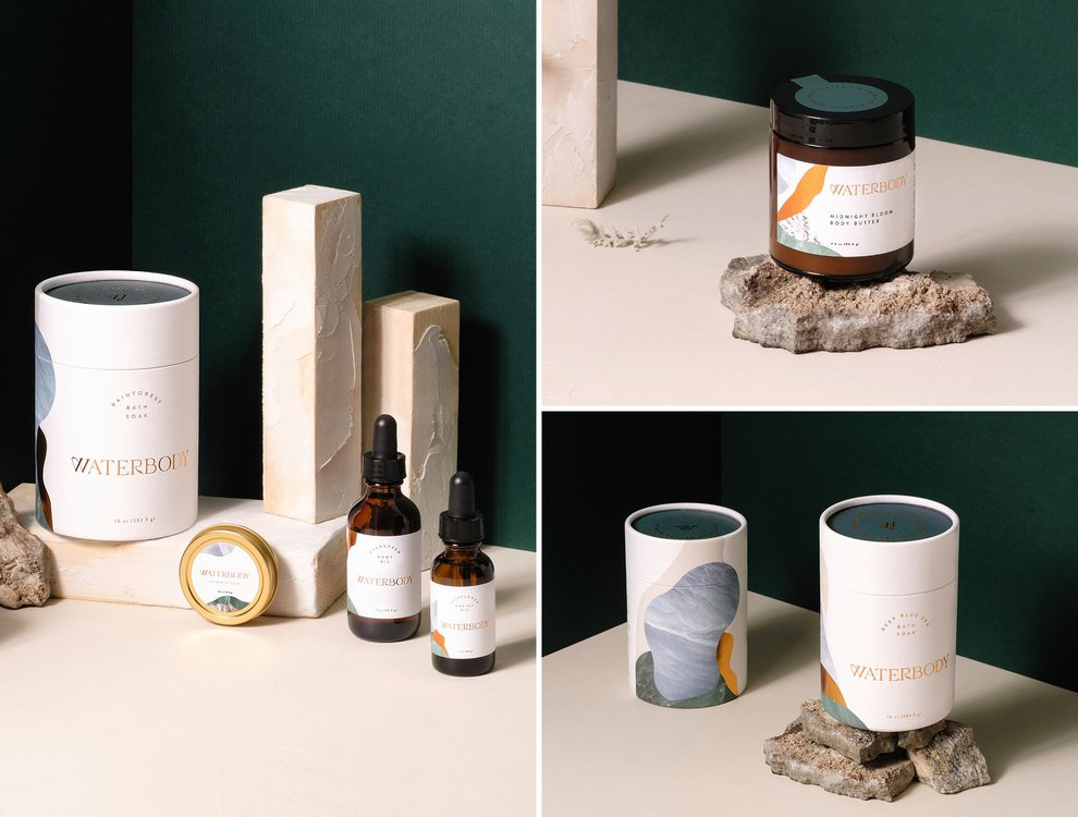
And what she came up with is nothing short of beautiful. The branding is soothing, natural and sleek while the color palette conjures up images of the earth, sea and sky.
The copper foil typography emblazoned across the front of each tube is original and luxurious, whilst also denoting a level of authority that lets the consumer know this is a brand that cares.
As for the packing, the cardboard tube design slides open to reveal the brand’s unique formulation inside offering a sense of surprise and delight.
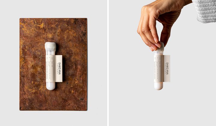
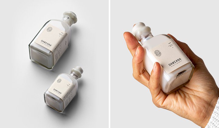
Conserva Collective
There’s something special about cosmetic products that look good enough to be ornaments in your bathroom, but there’s something even more satisfying when you know they can actually contribute to the world we live in.
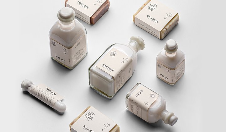
That’s exactly what the guys behind Conserva Collective set out to do with their marine conservation project - through soaps and shampoos.
The team is passionate about preserving the Gulf of California and so sustainability is at the heart of their brand. As an example, the seaweed used as an exfoliant in the soaps is harvested by students and volunteers as it washes ashore from the beaches of Baja California.
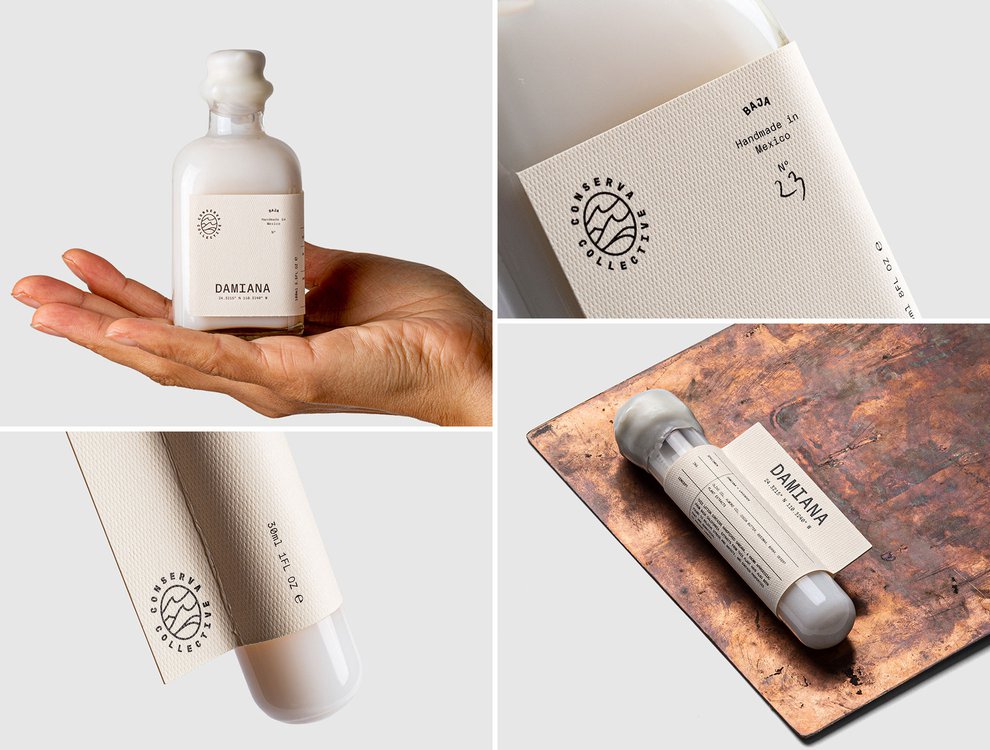
Their products come in beautiful glass bottles or simply wrapped in paper for an authentic and original look, while the labels are made from fine, mesh-like textured Rives Design corn.
Budapest based branding studio Peltan-Brosz are the brains behind the project.
They told Dieline “Today the Gulf is in peril. Unsustainable fishing - including the use of gill nets and bottom trawling - are destroying many of the coastal ecosystems. The fishing communities who have depended on these waters for survival are now on the brink of collapse, and are in need of alternative forms of income to support their families.
“Conserva Collective works alongside these communities to create alternative sources of income, on projects that contribute to marine conservation initiatives.
“We believe that by empowering individuals to learn from and appreciate our environment, we can position these communities as innovators and entrepreneurs, all while working towards the protection of our marine environment."
What do they have in common?
Each of these beautiful brands has clearly come up with their very own unique and clever design to stand out from the crowd.
Yet there’s something they each have in common - a strong brand identity. It’s something which is important to get right so that your product is seen by the target audience.
The best and easiest way to do that is to consider your packaging. This tends to be the first tangible thing consumers come across and remember, first impressions count.
We have put together a guide on how to build your own brand in eight easy steps if this is something you’ve been struggling with.
Whether you have already built a strong brand identity or are in the process of doing so, don’t forget to keep it consistent.
From the examples above, you can see that the designers didn’t just rebrand their packaging or the product. Many of them carried the design across all their platforms - from their online stores to their invoices and delivery notes.
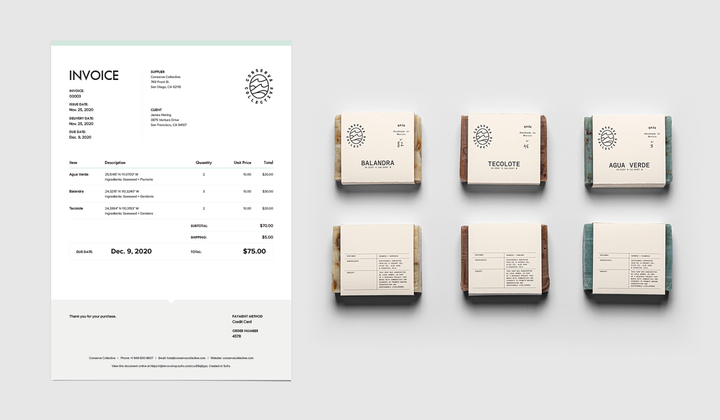
It is this high level of consistency and attention to detail that makes a brand become recognizable.
So, don’t let little details stop you from being consistent. With Sufio’s beautifully designed invoices that match your brand’s image, you can keep everything looking seamless with minimal effort.
Let Sufio automatically create and send beautiful invoices for your store today.
Professional invoices for Shopify stores
Let Sufio automatically create and send beautiful invoices for every order in your store.
Install Sufio - Automatic Invoices from the Shopify App Store