5 Creative Coffee Packaging Designs
Whether it’s a powerful espresso, a frothy latte or a deep, rich brew, more people than ever before drink coffee. And with the different blends, beans, and combinations, is it any wonder that it has become one of the world’s most popular beverages?
Coffee is now produced in more than 50 countries - and the world’s biggest exporter is Brazil, which ships around 5.7bn pounds of grounds each year, according to statistics from the International Coffee Organization.
Yet when it comes to coffee drinkers, it’s actually the Finns that are the fondest of the caffeine-rich brew, while neighbors Norway, Iceland, Denmark, and Sweden follow closely behind.
For many people, grabbing a coffee on the way to work has become part of their daily routine. But in this now saturated market, how can you stand out?
Well, aside from having a great product, the best way to physically get noticed is through your packaging.
Here we explore some of our favorite designs to show you who’s doing coffee packaging well and hopefully inspire you…
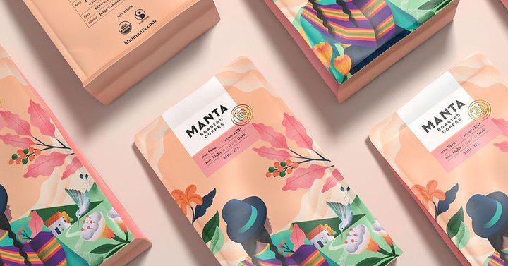
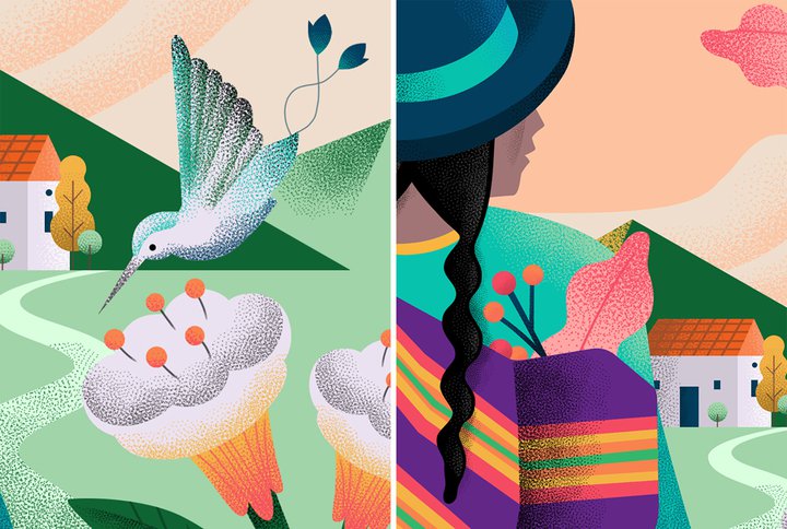
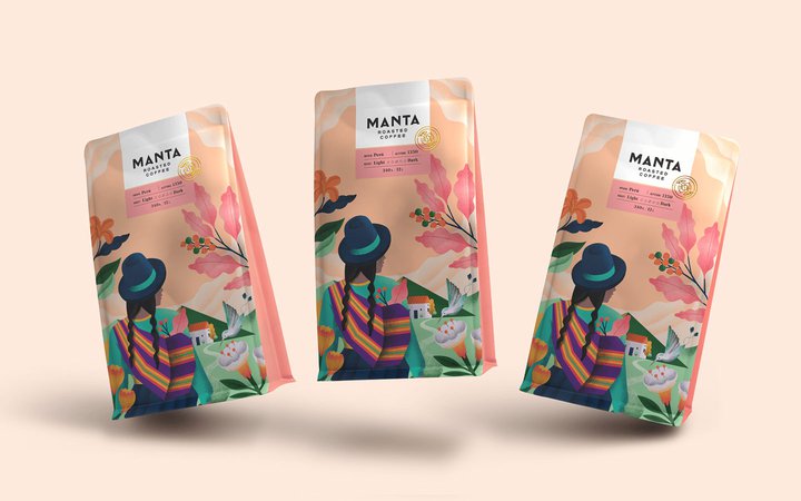
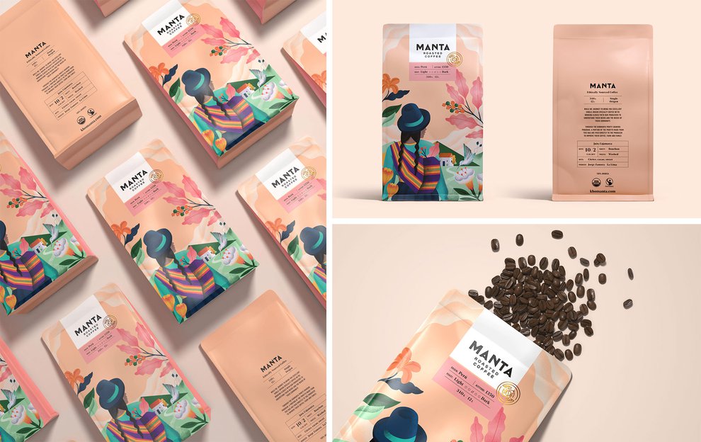
Manta Coffee
Peru is one of the world’s biggest coffee producers with connoisseur favoring the blend for its full body, aromatic flavor, and bright acidity.
So when designer Alejandro Gavancho was tasked with coming with the packaging for Peruvian brand Manta Coffee for retailers in the US, it seemed only natural to incorporate the coffee’s origins and culture within that design.
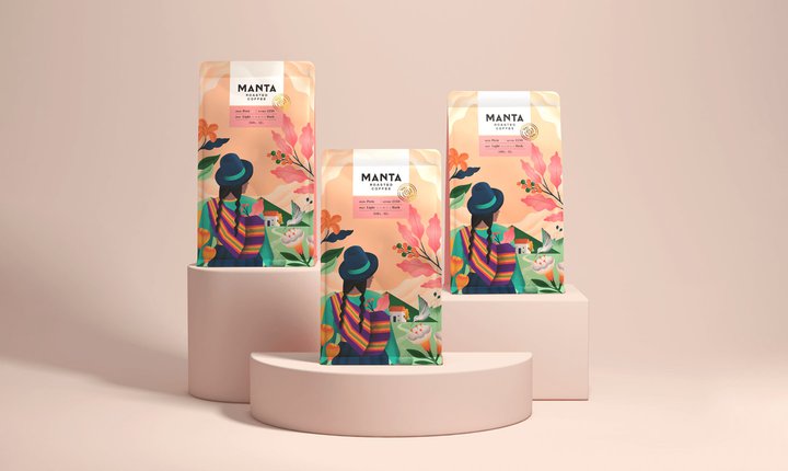
He came up with was an illustration of a scene that ties in all of the country’s elements in harmony, which started with the idea of the Lliklla or “mantas” as they’re known in Quechua. These are the brightly colored blankets that are worn by millions of women in the Peruvian Andes and originate from prehispanic times.
They serve two main purposes - to keep warm and carry produce or children - but they are also made manually and in artisanal way - just like Manta Coffee.
Alejandro said: “I started by designing the strategy for the brand based on the clients’ wishes. They wanted to represent some part of Peru on their packaging in a figurative way - that means not being abstract but literal. I planned to make an Illustration with vibrant colours as the main element in the packaging and create a modern brand identity through the logotype, isotype and typographies.”
“I had a very good connection with the client which helped the design process to be effective and smooth, so on the design side I had no problem. The only challenge was when producing the packaging, since the company is small and new. Coming from a family business, there were problems in finding a supplier of coffee bags that only printed a minimum quantity. Eventually they found a printing press in the US that was able to print the amount they needed.”
Alejandro, who lives in Lima and has been working as an independent graphic designer for almost two years, said that his proudest part of the design was the glowing feedback.
I think that as a Peruvian, I managed to transmit a part of my culture through the design to a foreign audience and I managed to make them understand what I wanted to reflect.
”
He added: “There is always a comment about the packaging and when they are at an event or fair with other coffee brands. The packaging always stands out from the competition, attracting the public through the image.”
Alejandro said that the client was great to work as “their energy and excitement was not only infectious but very encouraging”, adding that they’re now working on new varieties of coffee, and even considering a range of chocolate.
Speaking about his “versatile” design style, Alejandro added: “I like that my work is powerful, with many graphic elements like patterns, illustrations, collages, but at the same time there is still order and space to breathe that balances the design into something that will finally be functional and different.”
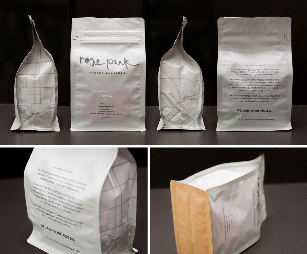
Rose Park Roasters
Picture yourself standing in the coffee aisle at your local supermarket, wearing a blurry pair of glasses, squinting at the products. What’s the most predominant color that meets your glare as the colors all start to merge into one? It’s probably something dark and moody - rich browns or dark hues, right?
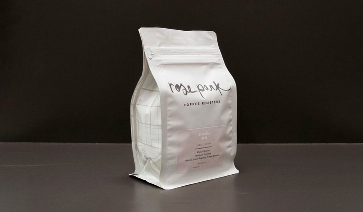
But what better way to stand out from the noise than to create a simple, white design. Well, that’s exactly what Rose Park Roasters have done with their clean, crisp bags of filter coffee.
Created by California-based Camp Design, the chosen color palette gives it that fresh and modern feel, while the silky-finish makes the packaging look luxurious. The hand-brushed watercolor logo is a beautiful and clearly considered decision, as it’s one that stands out from other coffee brands.
The design also subtly and cleverly hints that Rose Park Roasters is a local business by using a line map of their home city, Long Beach, CA on the side panels, which really gives it that community feel. And on the bottom, they’ve used kraft paper - something they say is a “reminder of their humble foundation”.
Dan Rossiter, one of the designers who worked on the project, said: “My proudest part of the design is the kraft bottom which was meant interrupting and adjusting the usual manufacturing process at the factory.”
Red Roaster
As the oldest coffee roastery in Brighton, England, and recommended by The New York Times, Red Roaster’s packaging had a lot to live up to. Thankfully the team at Pop & Pac did an incredible job transforming the brand from on-the-go coffee cups to bags that, quite frankly, you’d want to have on display in your kitchen instead of stuffed in a pantry.
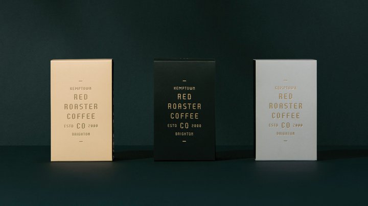
The designers were tasked with developing a refreshed brand identity that would align with Red Roasters' reputation as a pioneer and innovator. That brand would then be translated on everything - from the inside of their cafe to the coffee bags themselves.
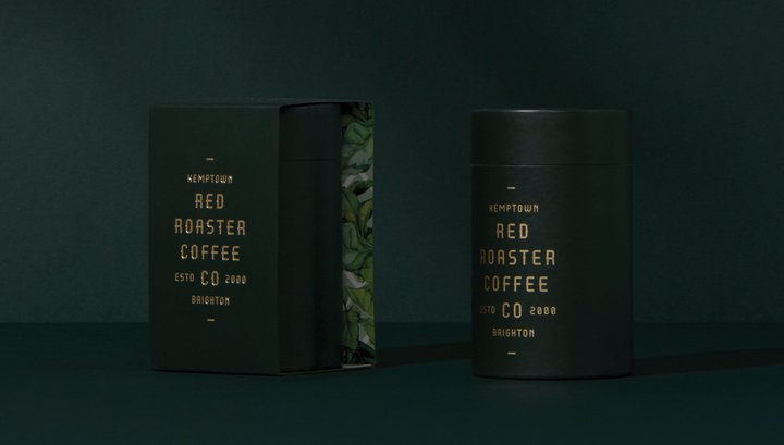
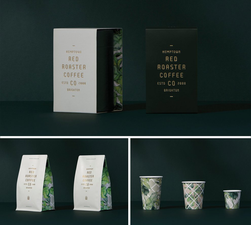
What they came up with for the packaging was a chic and stylish design that really showcases the brand’s heritage. The coffee is housed inside elegant cylinder tubes in a deep olive green color which oozes luxury. They then opted for slick gold foil lettering with the establishing year and ‘Kemptown, Brighton’ printed boldly on the front to truly hark back to the company’s roots.
Meanwhile, their coffee bags really translate a feeling of a ‘year-round oasis’, with their tropical print panels, and gold typeface which matches the recognizable signage outside the Brighton cafe.
Pop & Pac said: “Red Roaster was considered a pioneer in the coffee and cafe experience - but its brand and decor were tired.
“Our challenge was to create something unique and modern, with a touch of Melbourne, that would provide a refreshed and reinvigorated brand identity without relinquishing the considerable brand equity that existed within the local community."
“With interior design firm Stella Collective engaged by the client, the concept of ‘Botanical Punk’ was born. Being at the mercy of UK winters, when outdoor dining is not an option, Stella Collective created a year-round oasis, bringing the outside in.
“Our creative approach reflected this idea, with a typeface that challenged the expected and embodied the slightly oddball - yet beautiful - nature of the town.”
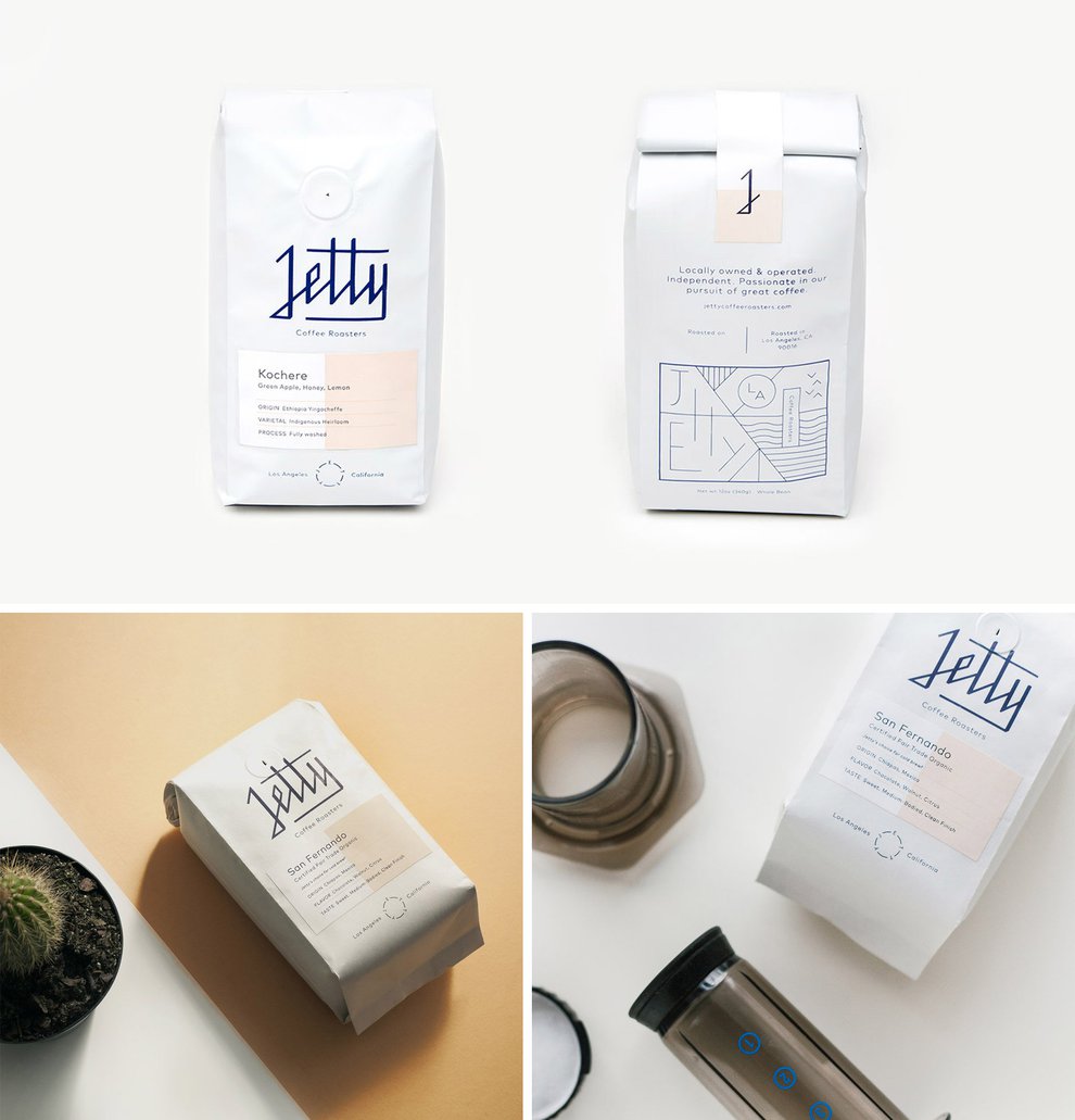
Jetty Coffee Roasters
Founded in 2017, Jetty Coffee Roasters is a Los Angeles based independent company founded by surfer Brien Baltzell.
He asked designers at Ludlow Kingsley to not only help him come up with a brand but also a name for his new line of coffee. And they did an incredible job.
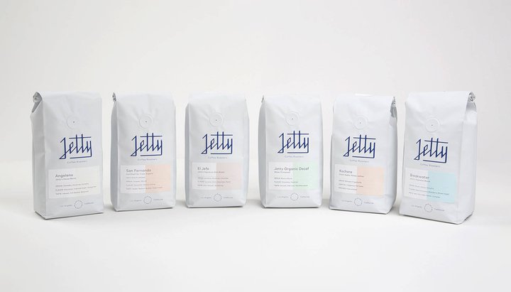
Each bright white bag of coffee is emblazoned with the striking navy blue Jetty logo and with its crisp clean-cut lines, it almost mimics the horizon between the sky and the sea.
The bags have an understated luxurious feel with their shiny silk finish, while the branding message makes clear that it’s a local brand with the community at its heart.
Ludlow Kingsley’s design team said: “Brien Baltzell is passionate about two things—coffee and surfing. He asked us to help name and brand his new line of coffee, hand-roasted in Los Angeles.”
“Keeping Brien's passions in mind, we named the company Jetty, and created an identity system that includes packaging, an illustration suite, and a custom e-commerce website.”
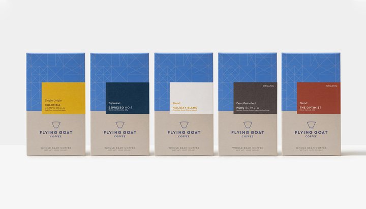
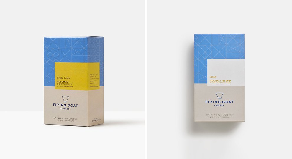
Flying Goat Coffee
When it comes to buying coffee, we’re more used to seeing it packaged in foil bags. But why should these things come in the same types of packages?
That’s what the guys at Flying Goat Coffee probably had in mind when they came up with this stunning redesign.
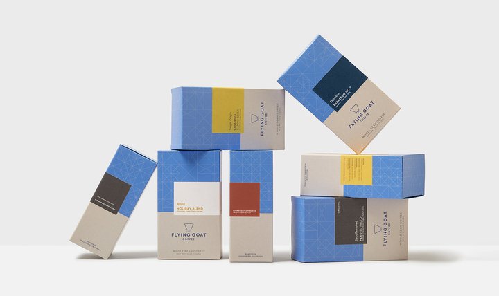
The San Francisco based coffee makers, who roast their blend every day to sell in their shops as well as online, asked Design Womb to help them come up with a new brand identity and packaging design that reflected their deeply rooted coffee expertise and the quality of what they do.
One of their key requirements was to introduce a more eco-friendly paperboard box option for their packaging made entirely from recycled materials and inks.
The team said: “We developed a totally custom branded base box structure which pairs with a flexible labeling system allowing the brand to use the same base box with different whole bean coffee labels as their offerings change throughout the year. We've also recently helped the company with its new branded compostable coffee bags.”
They opted for an earthy and utilitarian color palette with bright pops of block color to denote each unique blend.
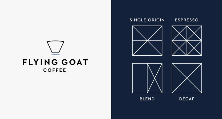
“The package design balances beautiful white space with the brand's custom repeat pattern which was created out of geometric symbols we designed for different types of coffee offerings such as blends, single origins, decaf, and espresso beans,” they added.
And it’s not just the outside of the packaging that got a makeover - the interior of the box is flooded with a deep navy blue color which flashes through the beautiful transparent bag of whole bean coffee.
Describing the design for the logo, the designers said:
“Flying Goat Coffee is all about high quality and an elevated coffee experience, so the logo also captures a bit of the ‘flying’ aspect of Flying Goat, through its simple elevated coffee icon and clean modern typography."
“Our art direction for this product photography also takes a no-fuss, high quality, coffee done right approach by keeping things simple with a little fun infused.”
What do these all have in common?
While each of these incredible designs is unique in their own way, they do all have one thing in common; a strong brand identity.
Good branding will place your product head and shoulders above the others - and it’s vital that your packaging communicates that.
So, take a look at your current packaging and ask yourself whether it speaks directly to your target audience, does it stand out on the store or virtual shelves, or is there something more you could do to demonstrate what your brand’s image and identity.
Remember that often your customer’s first impression or interaction with your product is when they see it and these initial feelings can be lasting.
If you need a bit more direction we’ve revealed how you can build a brand in just eight simple steps.
Once you’ve developed your brand identity - one of the best ways to become recognizable is to keep it consistent.
Think about some of the key players such as Coca-Cola, Google or Amazon - their branding instantly spring to mind because they’ve stuck to the identity that they established early on.
That means using the same logo, colors, and typography throughout all aspects of your business; from your website to the packaging and any marketing materials.
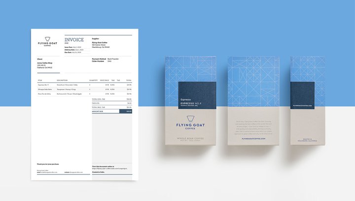
Consistency and clear brand identity go right down to even the little things like documentation - including delivery notes or invoices. Sufio’s beautifully designed invoices match your brand’s image and keep everything looking seamless.
Let Sufio automatically create and send beautiful invoices for every order in your store - get started today.