Inspirational Chocolate Packaging Designs
For many of us with a sweet-tooth, the packaging around our favorite chocolate can be easily overlooked as we rush to have the treat inside.
But for others, it may be the carefully considered design, unique materials or indulgent packaging that has grabbed their attention first.
The chocolate industry is a busy one though. In fact, a 2017 report from Zion Market Research valued the industry at $103.28 billion - a figure that is only set to increase.
So standing out in a noisy landscape isn’t always that easy.
Here we take an in-depth look at the process behind designing chocolate packaging, plus we’ve rounded up some of the most eye-catching, beautiful and creative examples we could find.
First, you need to consider the reasons why it’s important to bother investing in great packaging at all...
Why create attractive food packaging?
When it comes to food packaging, the most crucial aspect is that it protects the product inside - you wouldn’t want to open a carton of eggs and find them all cracked, would you?
Of course not… but function doesn’t have to compromise fashion - or at least really good design.
The purpose of design is to attract the customer, so clever packaging should really sell itself.
We’re talking strong brand identity, carefully considered design and even breaking the conventional code.
Brand identity
To get noticed, it’s important to have a strong brand identity. Your packaging should clearly communicate information about your product that speaks to the target audience.
Look at your packaging as your own brand ambassador up there on store shelves, waiting to be seen.
It’s often a consumer’s first interaction with your product - whether that’s in the supermarket, in a magazine or online.
So, when you’re developing your packaging design you really need to have a clear understanding of your brand’s identity and image.
We’ve previously discussed how you can build a brand in just eight simple steps, but to summarize you need to start by asking yourself some basic questions:
- What is my product?
- Who is my target consumer and competitors?
- How is it different from other products on the market?
- What’s my company message?
The answers to these should help you figure out your brand’s identity and in turn dictate the color, size, shape, and materials of your packaging.
Once you’ve crafted your brand identity it’s important to remain consistent - that way you become recognizable.
If you take some of the world’s biggest brands, say Apple, Coca-Cola, or Cadbury’s, you can instantly conjure up the image of their logo, color scheme, maybe even their slogan, in your mind.
So that means using the same logo, colors, and typography throughout all aspects of your business - from your website to the packaging and any marketing materials.
And while they can be easy to overlook, don’t forget important documents such as delivery notes or invoices. Sufio’s beautifully designed invoices match your brand’s image and keep it all looking consistent.
So, who’s already doing it well? We’ve pulled together some of our favorite chocolate packaging designs - from minimalistic and plain to the unique and artistic…
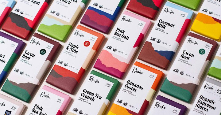
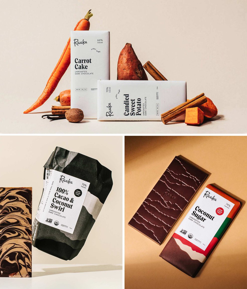
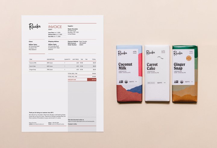
Raaka
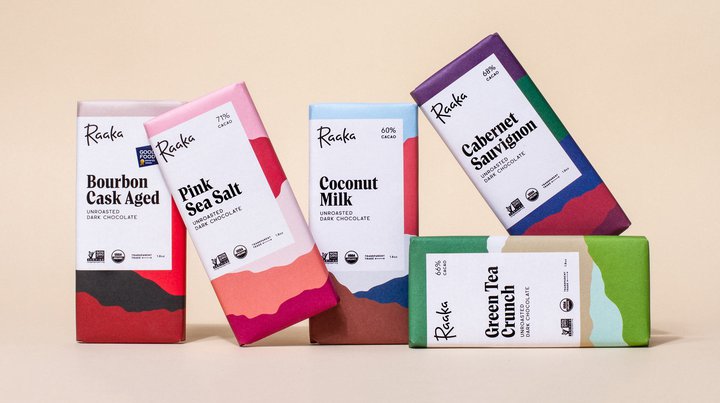
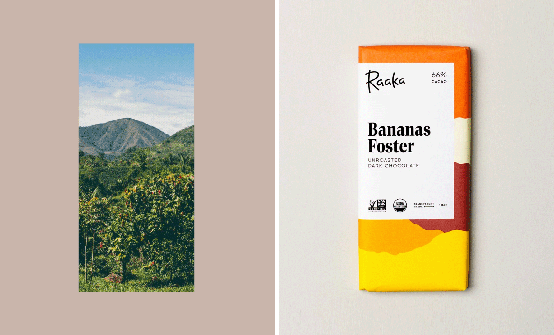
Raaka has been crafting bold and innovative chocolate from its factory in Brooklyn, New York, since 2010. The company uses an unroasted process to allow the cacao to keep its vibrant, fruity flavors.
Visual designers Andrea A. Trabucco-Campos and Simon Blockley worked on the company’s rebrand.
Simon, a California Bay Area native and currently works freelance in San Francisco, told us: “We started by conducting a study of our existing brand and identifying key areas for improvement. From there we began exploring both brand and packaging routes in tandem.
From the start, Raaka has been focused on building transparent relationships with cacao farmers across the world and staying true to the flavors of single origin cacao beans by bringing out their flavor through an unroasted process.
The new identity leans heavily on these two aspects: the bold colors and typography clue to the flavor profile of the bar, and the abstract geometry of the backgrounds are based on the actual cacao origins of the given bar.
Once you start engaging with and unwrapping the bar, the story of those colorful backgrounds and Transparent Trade come alive as you are led to the packaging interior where we’ve documented the full story.”
Writing on his website, Andrea said: “We started from a strategic consideration: elevating the most important aspect of Raaka’s chocolate—their uncommon and vibrant flavors.
Raaka sources their single-origin cacao from growers across the world - using photography from these locations, we created abstract backgrounds that leverage color to embody the flavor profiles of each bar.
”

One of the things they noticed early on was that Raaka’s labels were often obstructed by shelf displays, so they repositioned it for better on-shelf impact.
They also designed an entirely new typeface, Alku, which Andrea says was inspired by a lowercase “a” he spotted on the cover of a book by Stephen Rogers Peck.
“The typeface was Trooper Roman, which prompted me to look deeper into the genre with classics like Tom’s Roman, Times Modern and Perpetua Super. They share a heritage of editorial use, maintaining an elegant tone,” he said.
Simon explained that the toughest part of the project was convincing the client that change was for the better.
He said: “Raaka had their original packaging for seven years, so it was tough to break away from it knowing its familiarity with customers. As a small maker, they can’t take a big hit, so members of their team were rightfully hesitant about the whole project.
If their previous packaging was a total failure and customers hated it, the process would have been much easier, however Raaka wasn’t telling their story with the previous packaging system and as they grew it was really starting to show.”
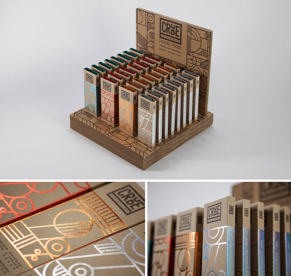
Crude
Crude raw chocolate pretty much lives up to its own name. It contains just two ingredients - cocoa and sugar.
The cocoa varies in different strengths, so for the hardcore you’ve got 100% raw chocolate, which is of course sugar free, down to 70%.
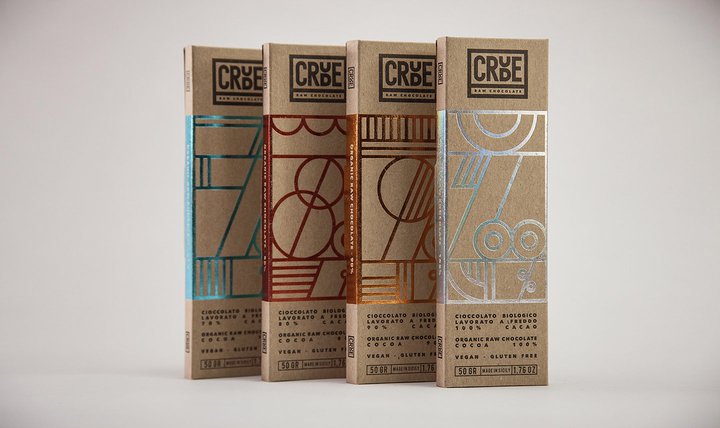
Each bar of chocolate is wrapped in simple “cheap” brown cardboard packaging, but completed with a metallic foil denoting which percentage of cocoa it contains on the front to give it that luxury edge.
While the san serif Avenir Next typeface gives this Italian brand a friendly, warm feel.
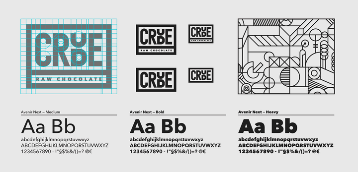
Designed by Anna Rodighiero of HappyCentro, Crude’s brand image is consistent across its products, packaging and website.
Federico Padovani, project manage at HappyCentro, said: “The client was looking for pure essentials shapes, that echoed at first sight to product features, with no additions.
Here is where we started - by building the entire identity with an intricate structure of simple shapes, and the typo we used to visualize percentages of cocoa mass: 70, 80, 90, 100%.
”
The package is obtained by coupling two straight materials: a cheap raw recycled cardboard commonly used for mass packaging and luxurious metallic foils as queens of precious print ennobling, hot stamped (red, blue, copper and rainbow).”
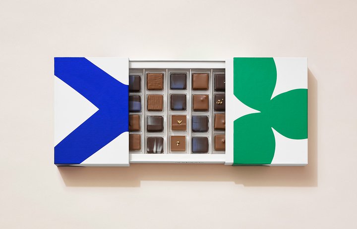
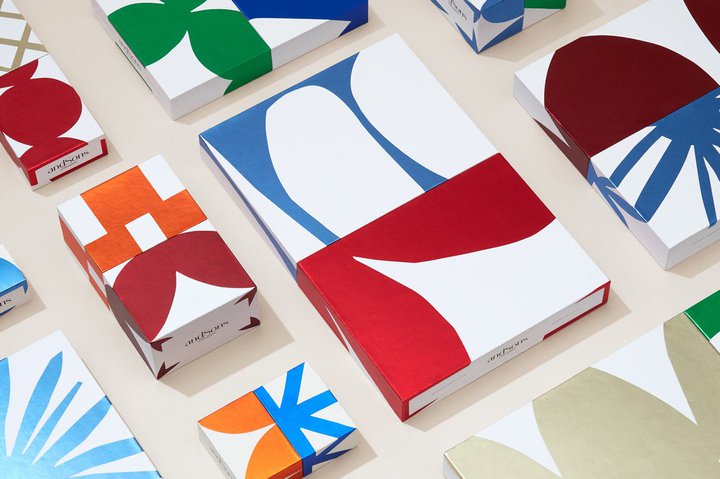
andSons Chocolatiers
Based in Beverly Hills, California, andSons Chocolatiers is a second-generation chocolatier which merges the themes of traditional European heritage and the creativity of LA.
Base Design were tasked with the company’s rebrand - including the name which is a nod to its past as brothers Marc and Phil Covitz take their mother’s business into the future.
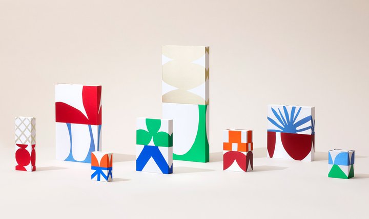
Min Lew, Partner & Creative Director at Base Design, New York, told us: “Rather than looking outward for inspiration, we looked to the project and client as muse. The design was inspired by the Beverly Hills location and the story of the two brothers behind the name andSons.
Growing up, brothers Marc and Phil Covitz learned everything there is to know about fine chocolate from their mother's chocolate shop.
We created an iconic brand and a set of high end, collectible packaging that proactively play on the brand’s inherent tensions – tradition and innovation, refinement and generosity, luxury and surprise.
”

Base also came up with a system of boxes, each with a different custom-drawn pattern, that open from the center to reveal the indulgent treats inside. The colors are bright but also refined, evoking that sense of LA sunshine whilst also keeping it elegant and luxurious. The team also partnered with a number of artists to develop special editions.
And the best part? They have endless combinations, so they can be slotted together with other designs, colors or sizes. But Min says the boxes were probably one of their biggest challenges.
She said: “We wanted the physical box to be as iconic and conceptual as the design, so rather than sticking to standard chocolate box measurements, we developed a modular system in which each box interrelates and stacks perfectly with the other boxes in the system.
Practically speaking, this increased the workload immensely because we had to deal with two parameters – the interior chocolate tray and the exterior box.
Luckily, we had an amazing production partner, Cutpack, who, after many iterations, developed a flawless system. To get the sizing just right, the interior and exterior layers of each box were custom-made.”
And what are the designers most proud of? Well, Min tell us it was being brave enough to be unconventional.
She said: “What I’m most proud of is our refusal to follow the conventional codes– brown boxes and gold lettering – of luxury chocolate packaging.
Although the journey was very strategic and a lot of hard work went into creating the brand, we wanted our chocolate boxes to be a cause for instantaneous celebration, full of surprise, delight, and LA sunshine.
I’m proud that what you see as the end result is a playful and effortless packaging system that aims to create desire.”
Base also didn’t stop at the packaging. The design flows right onto the website where as the user scrolls down, the box slowly opens, like a jewelry box revealing a precious diamond. Bravo!
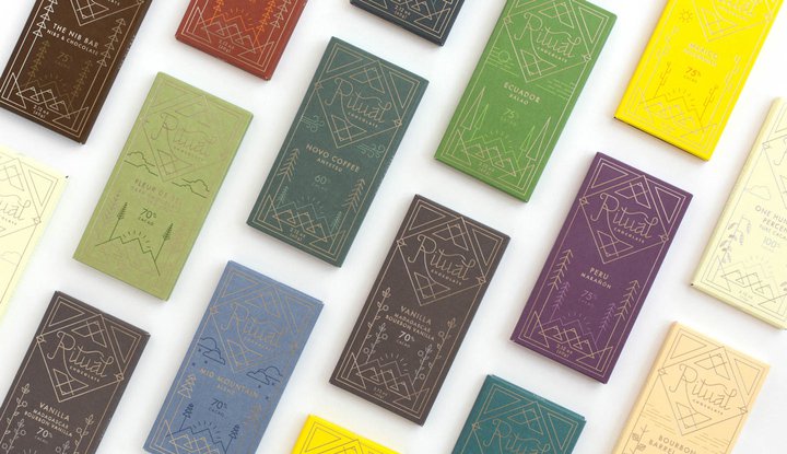
Ritual Chocolate
Founded in 2010 by Robbie Stout and Anna Davies, Ritual Chocolate is a quality brand which uses classic European methods with a modern American style.
The team recently moved from their base in Colorado to a small factory in Park City, Utah, where they are involved in the entire process - from sourcing some of the highest quality cacao in the world, to handcrafting each small batch of chocolate.
Company owner Anna Davies said: “Ritual chocolate is a bean to bar chocolate company which means we do the whole chocolate making process from raw cocoa bean through to the finished chocolate.
When we were looking at a new brand or a brand that we wanted we really liked the idea of bringing in more lifestyle aspects.
We’re here in the mountains, that’s something that’s really important to us, our lifestyle and what we feel inspires us. We wanted to bring in more natural elements but also keep it modern.”
As part of the company’s move, Anna and co-founder Robbie Stout decided it was time for a change and they tasked modern8 to help them develop a new brand identity and packaging.
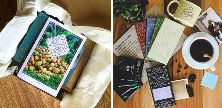
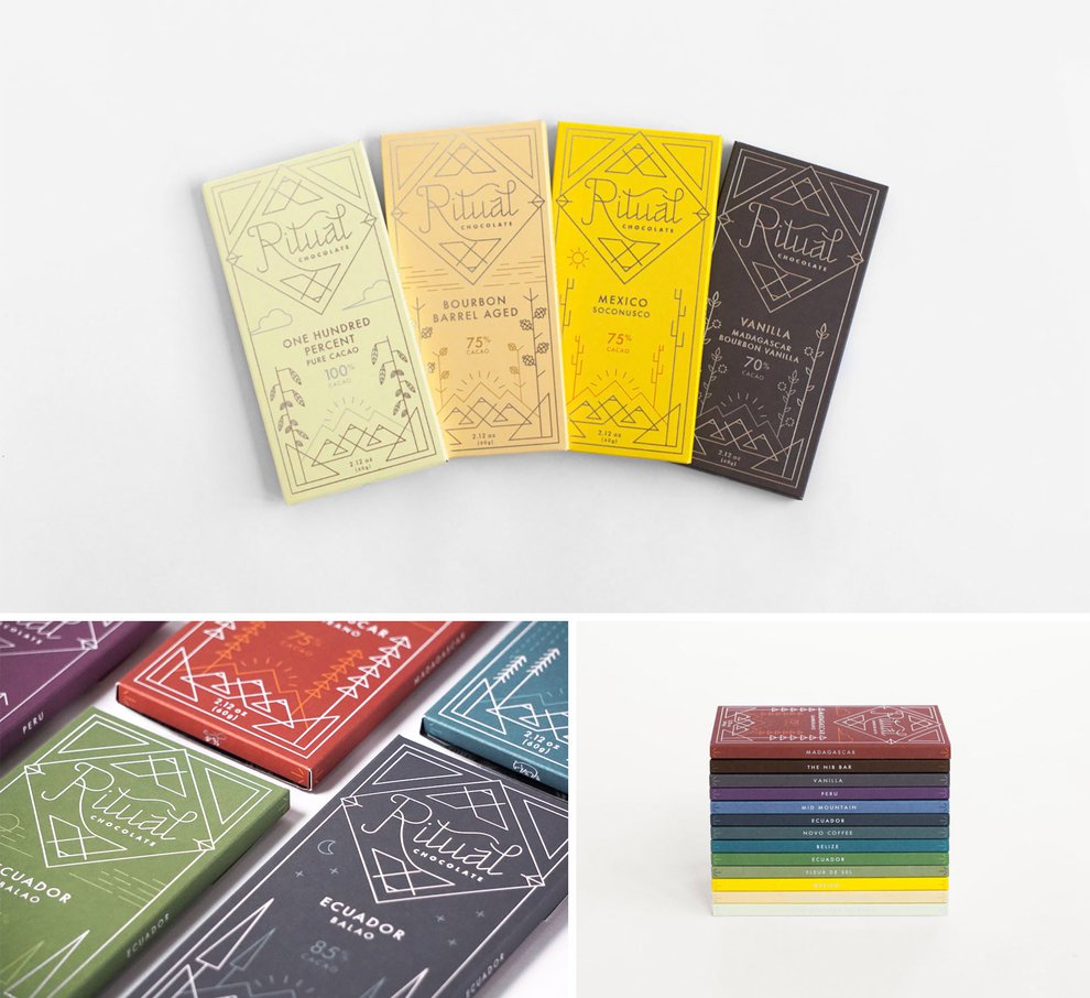
What they came up with was a beautiful design that spoke to both the company’s new Utah base and the origin of each chocolate bar’s beans. The illustrations and text are created with delicate lines while the outer packaging opens in a unique way - a little like opening an envelope.
Inside, the consumer is given a little more information about what went into making their bar of chocolate and who Ritual Chocolate are.
Kent Carollo, who now runs his own studio, said: “One thing that was really cool and a bit unique to working with Ritual is that they had a really strong design sense coming in and a really good idea of what they wanted and an aesthetic they wanted to achieve with this project so they actually brought a lot to the table and it gave us a lot to work from.
So, as far as designing the packaging goes, more than anything we really wanted to be sure that we connected their product to the place it was produced, so in this case Park City.
”
Mike Harris, fellow modern8 designer at the time, said: “One of the distinguishing features we wanted to include was a specific color per bar per flavor.
The color scheme we came up with was actually supposed to be reflective of the kind of colors you’d see in Utah, especially Park City but then we included some red for the red rock in southern Utah and Moab.
We know how much place is important to Ritual chocolate and we wanted that to be reflected in many aspects of the design.
The packaging itself is one of the most intriguing things, I think. It unfolds and the way it unfolds is it kinda tells us a bit of a story and it reveals a little bit more about what Ritual is about and the kind of experience they want you to have and it’s something I think most chocolatiers can appreciate.”
Randall Smith, President of modern8, told the Dieline: “Ritual Chocolate recognized a need for a new logo and package design that re-positioned their product to relate more authentically with their new Park City mountain home.”
Ritual co-founder Robbie said: “Our new packaging is one that sells well but also after you buy it and start opening it there’s more to reveal and you haven’t really seen the end of it yet.”
What do these all have in common?
One thing that stands out more than anything else about each of the above designs is that they all share one thing in common: the importance of a strong brand.
It’s clear that each of these companies has worked hard on their brand’s identity in order to help transform their packaging - and even carefully considered it across the rest of their business.
So, why not consider taking a look at your company’s brand and whether there is any scope for you building a stronger image?
And once you’ve spent all that time, money and effort on ensuring you’ve got a strong brand, don’t fall at the final hurdle and forget to align that hard work with your invoices.
With Sufio you can create beautifully designed invoices and make them consistent with your brand and packaging.