Why Brands Should Unify Packaging Across All Product Ranges
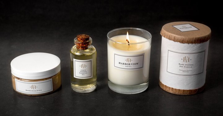
When it comes to establishing a successful e-commerce company, you’ll know that having a valued and worthy brand is half the battle. And in this tricky, over-saturated market, the most important way to build your brand is to be consistent, especially with your packaging.
This is how well-recognized brands gain their customer’s trust and what makes them want to repurchase - whether that’s a conscious decision or not.
But brand consistency is so much more dynamic than just sticking your logo on everything.
What is the importance of brand consistency?
Brand consistency allows customers to identify you and your purpose, through all your touchpoints - from your design and packaging to the words and messaging.
To understand the importance of this, let’s put it into context. Think about your brand as a ‘friend’ (stick with us on this one)…
So, you have this friend who is always on time for everything, and suddenly they start showing up late, or maybe not even at all. Something seems to have changed and to you they no longer seem dependable. For that reason, your friendship suffers. Well, the same thing can happen with brands.
Companies can spend a long time building a strong brand which their customers can trust, only to damage brand loyalty with inconsistent changes.
Why unify product packaging?
You’ve worked hard on establishing your brand’s message and identity but to make it count, this needs to be carried across into the design of your packaging.
It is where your customers have the most interaction with your branding, so it’s probably one of the most important areas to focus on.
People like things to be uniform; it makes them reliable. So, there’s very little point presenting your customers with fun and quirky packaging if you’re then going to have a flat and boring online shopping experience.
Consistency doesn’t mean boring. It means connecting with your customers in the same voice, message, and personality in many different ways over a period of time.
Developing brand guidelines is one of the ways to ensure all aspects of your branding is consistent, without becoming dull or watered-down.
Consider creating a brand bible or style guide for things like:
- Typography
- Text alignment
- Color scheme
Having these helps align your brand across all areas including the logo, online store, marketing materials, packaging and even important documents like invoices and delivery notes.
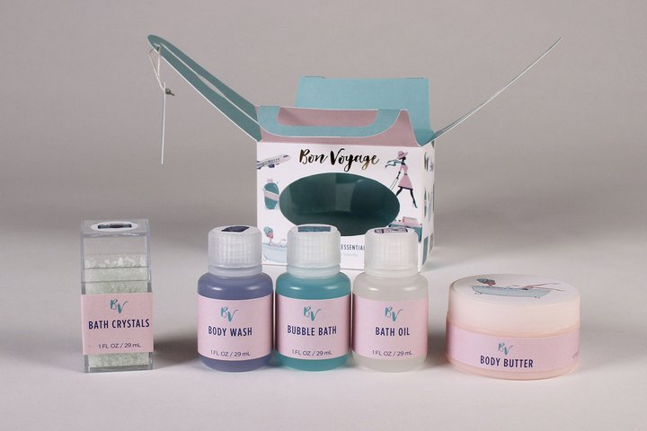
How to unify a range of products
Unifying packaging across all of your product ranges isn’t always an easy balance to strike.
Of course, you want your customers to easily distinguish between the different products but you also want them to quickly recognize that all the variants belong to the same brand. You also want them to notice when a new product is added to the line.
It’s a matter of trade-off and balance: a stronger range unification can take away from variant differentiation and vice versa.
But there are a number of brands using uniformed packaging to create their own visual brand block on the (virtual and physical) store shelf - and doing it well. Here are just a few of our favorites…
1. The Ordinary
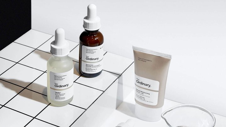
The Ordinary, from Deciem, stands out as a champion of brand consistency with its simple yet carefully designed packaging. Every product has exactly the same design, comprising of laboratory pipettes or vials and pharmaceutical-style labeling.
And each is named after its active ingredient and percentage strength as opposed to its intended effect. For example, rather than calling one product blemish and congestion reducing serum, one is called Niacinamide 10% + Zinc 1% (30ml).
2. Frank Body
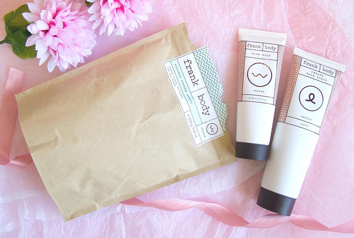
Another awesome example from the skincare aisle is Frank Body, who make coffee-based scrubs.
The Australian-based company stripped it right back - both with their products and their packaging - to create a fun, quirky experience for their customers.
The cute millennial pink containers and bags are not only bang on trend, but feature their own witty messages on the front. We like the cacao shower scrub, which says: “Imagine a world where you shower yourself in chocolate.” Just imagine!
And if that wasn’t enough, Frank Body also include a matching cheeky packaging insert encouraging people to share their experience on social media. It’s no wonder they’ve managed to grow a huge following of 687k followers on Instagram alone.
3. PRESS
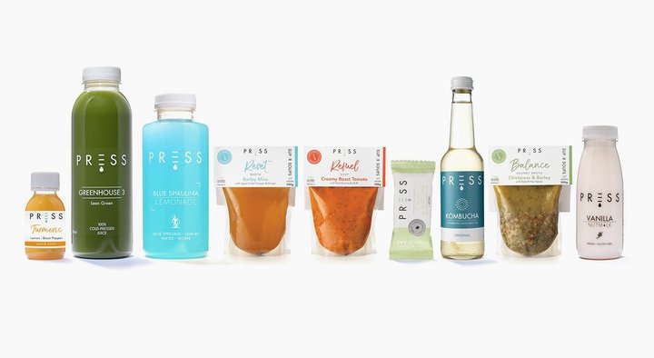
The health food industry is one sector that has seen a surge in interest in recent years, so all the more reason to stand out from competitors.
Cold-pressed juice experts PRESS is one brand nailing it with a strong brand identity through clear, consistent packaging.
Keeping the bottles the same allows customers to focus on the actual contents itself - whether that’s an extra helping of ginger in the Greenhouse line or a touch of mint from the Orchard collection.
Plus the juices are colorful and eye-catching enough!
4. Vinebox
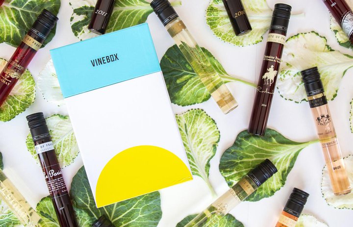
Vinebox is not only one of the smartest and convenient wine subscription service on the market, but it’s pretty original when it comes to packaging too.
Each wine is a sample-sized serving and comes in a sleek glass test tube style container, which has been created with a patented bottling technology to ensure the preservation of both taste and quality.
There are no seams in the glass - and most importantly, each one maintains the vineyard’s original design so the customer can get the full, table-side sommelier experience at home.
The wines are also delivered in a sleek and sophisticated box, which make them perfect for reuse, and even some quirky little cards with quotes inside for the special, final touch.
Keep invoices brand consistent
So, you’ve spent time, money and a lot of effort on ensuring brand consistency across all aspects of your business. But don’t fall at the final hurdle and forget to align that hard work with your invoices.
These documents are sometimes easy to overlook - after all it’s just a sheet of paper that goes inside the packaging, right? Well, not necessarily. It’s that extra attention to detail that is sure to show your customers your the kind of company that knows their brand and their consumer.
With Sufio you can create beautifully designed invoices and make them consistent with your brand and packaging.
Professional invoices for Shopify stores
Let Sufio automatically create and send beautiful invoices for every order in your store.
Install Sufio - Automatic Invoices from the Shopify App Store