6 Fonts That Changed History
Letters don’t just carry information—the font they’re set in also affects how we feel about what we’re reading.
If we see text written in a clean, minimalist font, we’ll associate it with modernism, progress and technology, while playful fonts like Comic Sans will make us reminisce about cartoons and kids’ birthday parties.
Choosing the right font is just as important as the message you’re trying to communicate—especially when talking about fonts for businesses. If you’re not careful, your brand might end up attracting ridicule instead of customers.
Something similar happened to James Cameron’s ‘Avatar’ after audiences saw the title infamously used Papyrus—a cheap-looking, faux-ancient font.
In this article, we’ll list a few fonts we consider important to the history of publishing, advertising, and even humor! We hope our picks help you understand typography a little better so you can make the right font choices for your online store.
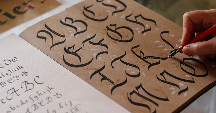
Gutenberg

The first font to truly revolutionize the world was seen on the first printing press, invented by Johannes Gutenberg in 1439. The typeface with which he printed the first book—the Bible—was recreated as a digital font named Gutenberg.
Although today this font might be a little hard to read, it mimics the handwriting of the monks from Gutenberg’s time. The transition from hand-copying books to the printing presses marks the beginning of the Modern era, making this font a key part of history.
Oh, and by the way, the terms lowercase and uppercase also date back to the old printing press—because when printing was done, the single letters were removed from the press and stored in physical cases: one case for lower and one for upper letters.
Times New Roman
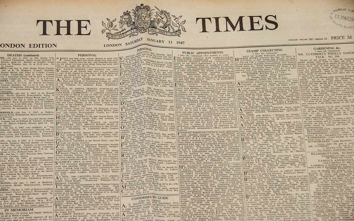
Many will recognize Times New Roman as the first font they used to type on a computer. It’s no surprise—it was the default font in Microsoft Word between 1992 and 2007.
The “Times” part of the name refers to The Times—the British newspaper that originally commissioned this font in 1931.
“Roman” denotes that this font belongs to the Roman type fonts, inspired by the script used in Ancient Rome (most notably, on Trajan’s column, dated 113 AD) and then revived during the Italian renaissance period.
Times New Roman is a serif font, meaning small strokes—called serifs—get added to the ends of each letter. Serif fonts (as opposed to sans-serif fonts such as Arial or Helvetica) are supposed to be easier to read, even in smaller sizes, and are therefore used predominantly for large bodies of text.
However, because it was used as a default font in Microsoft Word, texts set in Times New Roman may now come across as somewhat boring.
Bookerly

Bookerly may be one of the most consumed fonts worldwide—and yet you’ve probably never heard of it before.
That is because few people have ever had to search for it.
Bookerly is actually the default font on all of Amazon’s Kindle ebook readers since 2015. Whatever book you open on your Kindle next, the device will render the text in Bookerly by default.
As a member of the serif family of fonts, and thanks to its generous letter spacing, Bookerly is prized for its easy readability.
If you own a Kindle and haven’t found a reason to change the default font, you’re also a satisfied Bookerly user. Estimates show that Amazon sold around 100 to 150 million Kindle devices and 500 million ebooks, so Bookerly may be hard to trump in the sheer quantity of text that is read in this font.
Impact
Impact may not have changed the history of the world, but it definitely made its impact on the history of the internet and internet culture.
The font was a part of the Core fonts for the Web, a project that Microsoft ran in 1996-2002.
Back then, Impact was one of only 11 fonts that were considered universally available across all computers which accessed the internet.
Nowadays, dedicated font packages are a part of each website’s resources, so every website can render text in its own unique font.
The availability of Impact made it a popular choice among web designers and creatives that used it not only for serious work but also to create funny images.
Impact became famous in the 2000-2010s meme formats (also called image macros), and so contributed to the rise of humorous websites such as I Can Has Cheezburger? and 9gag. Impact became such an integral part of internet comedy that it even has its own Know Your Meme entry.
Didot
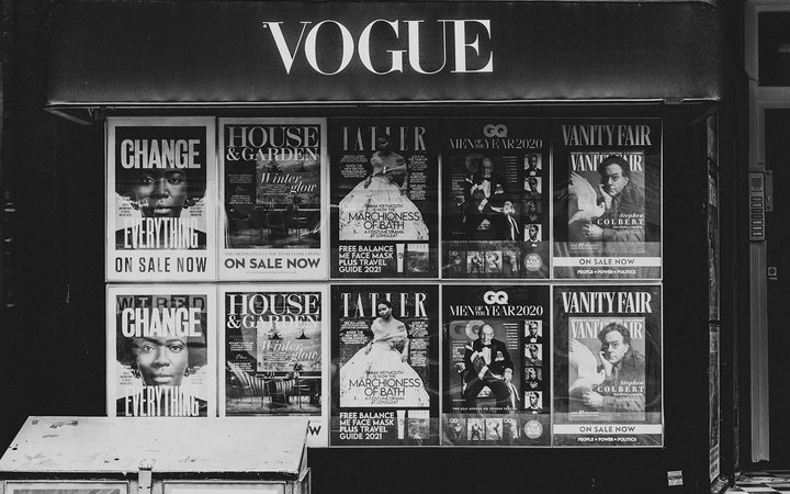
Some trends can go out of fashion in less than a year, but timeless designs stay relevant for centuries. A good example of this is the famous Didot font.
The font’s creator was Firmin Didot—a member of the Didot family, which was already established in Europe’s design scene. Many members of the family were printers and typographers in France in the 1700s and 1800s.
Didot is a serif font, which would traditionally mean that it’s easy to read and it’s well suited for large quantities of text. However, the notable contrast between its thick and thin lines makes fashionable and luxurious brands want to use it to make a statement.

Didot has been associated with fashion for decades now—it’s used as the title font of the lifestyle magazines Vogue, Elle and Harper’s Bazaar, and even the logos for clothing brands like Zara and Calvin Klein’s “cK.”
Futura

Some fonts become so connected to a particular brand that whenever we see any text written in them, we immediately think of that brand.
In Futura’s case, the font was actually associated with two world-renowned brands at the same time.
Designed in 1927 by German Paul Renner, the Futura font is distinct, with imposing geometric forms, typical of the Bauhaus school of design that was popular in Germany back then.
Both IKEA and Volkswagen adopted Futura as their primary font. It’s worth noting the furniture company and the car manufacturer used the font in slight variations, though.
The Futura font stood as part of the most iconic adverts of all time and helped both brands build their visual recognition.
Interestingly, both companies recently changed their font after decades of use—IKEA in 2010 and VW in 2015. The changes were caused by the requirement to use a font that supports characters for multiple languages.
Choose the right font for your invoices
Do you want your Shopify store invoices to match your website and product packaging?
Sufio’s new integration with Monotype gives you access to over 40,000 premium fonts for your invoices, credit notes, reminders and more.
Choose iconic fonts like Helvetica, Futura, Avenir, Frutiger, and Garamond, all of which are used by the world’s leading brands today.
Learn more about the integration in our product news article or try Sufio and discover new fonts on our Typography page.
Professional invoices for Shopify stores
Let Sufio automatically create and send beautiful invoices for every order in your store.
Install Sufio - Automatic Invoices from the Shopify App Store