5 Best Practices for Effective Shopify Store Design

A great product isn’t enough to thrive as a Shopify store. Standing out in the competitive ecommerce market requires one thing more than anything else: a powerful brand.
And for building this brand, few things are more important than your Shopify site. A well-designed store effortlessly impresses visitors and rapidly turns them into paying customers, while a poorly designed one gets people clicking off in a matter of seconds.
With the importance of getting this right in mind, we’ve put together a list of five best practices for creating the perfect Shopify store.
Strive for simplicity

In today’s age of information overload, it is more important than ever to streamline your ecommerce site and reduce on-page clutter so that your customers can focus on what matters: your products.
Many studies have provided proof already (such as this one), showing that people almost universally find websites with simple designs to be more appealing.
In addition, keeping your site’s conversion copy concise and to the point will help to prevent visitors from becoming overwhelmed. If your unique selling proposition isn’t impossible to miss, your copy is too complex and needs to be sharpened.
Make your site easy to navigate

Tying in with the need for simplicity is the importance of designing your Shopify store so it’s seamless to navigate.
If your customers cannot quickly find what they are looking for on your site, then they are likely to give up and look elsewhere.
This window of time for keeping someone’s attention really is short: a majority spend fewer than 15 seconds on a page.
To avoid having most visitors leave your site as quickly as they entered, your site needs to have a clear and concise navigation bar at the top, an easy-to-use search function, and filter options so that customers can narrow down their search results.
Use a carefully customized theme with powerful branding

We’ve talked before about how important brands have always been, going back as far as ancient Egypt. A powerful brand sets you apart from your competition and leaves no doubt in people's minds about what you represent.
One of the most important ways to create a strong ecommerce brand is to make your site’s theme as captivating as possible. Harness the power of elements like colors and fonts, as these go a long way in making memorable experiences for potential customers.
For example, research shows that having a signature color alone increases recognition of your brand by up to 80%. So the potential of a small design choice like these really shouldn’t be underestimated.
Strongly impressing your brand values on your customers will likely necessitate investing in one of Shopify’s customizable themes. A brand should always unique, meaning that your website theme should be too.
Use compelling photos and videos

Just as brick-and-mortar stores use attractive displays to draw in shoppers, an online store needs to use interesting visuals to catch the eye of visitors.
High-quality photos and videos give potential customers a clear sense of what they’re buying, which helps to build trust and confidence in your brand. The same thing goes for using visuals to convey your brand’s story and personality.
Ecommerce websites can often be too bland and two-dimensional, so high-quality images and videos can go a long way in providing the visual stimulation that increases consumer engagement.
Unsurprisingly then, there’s a lot of research showing that photos—particularly those with humans in them—boost website conversion rates.
Analyze and test

Even the best general advice doesn’t always survive contact with reality, and what currently works may not do so forever. Ultimately, all ecommerce stores need to adapt and change to meet consumer needs.
Our final tip, therefore, is to leverage the power of customer data and insights to analyze and test how users are interacting with your site and what areas may need improvement.
A method called A/B testing can be very useful in optimizing your site’s conversion rate. This involves testing two different versions of a page on your site to see which one performs better in terms of the conversion rate.
Tweaking minor factors like the design of buttons or the location of CTAs can make a significant difference to conversion rates, but you’ll never know for sure what works best unless you use methods like A/B testing.
Conclusion
By following these five best practices for Shopify store design, you'll be well on your way to creating a strong ecommerce brand.
Effective design doesn't end with your website, however. Going beyond marketing and incorporating solid design principles into all other aspects of your business is vital for creating as durable a brand as possible.

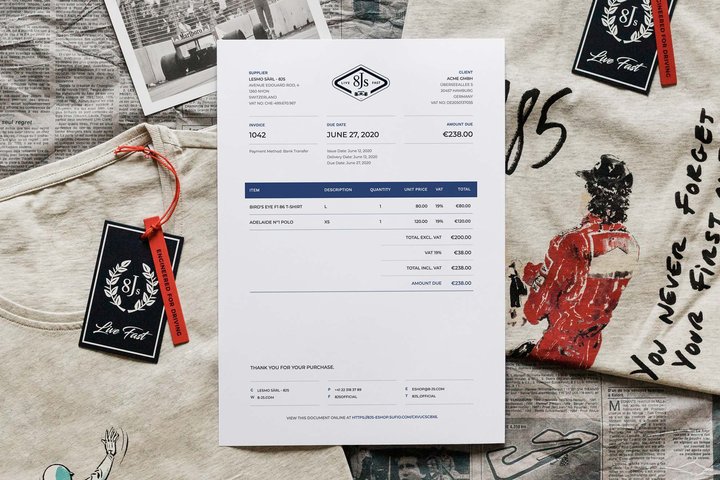
Enter Sufio. Our Shopify app allows you to create elegant, professionally designed invoices that can be fully customized to match your unique brand.
With Sufio’s powerful automation, you can seamlessly generate invoices compliant with tax legislation in over 50 countries.
Head to the Shopify app store today for a 14-day free trial of our invoicing software.
Professional invoices for Shopify stores
Let Sufio automatically create and send beautiful invoices for every order in your store.
Install Sufio - Automatic Invoices from the Shopify App Store