Cool CBD Oil Packaging Designs
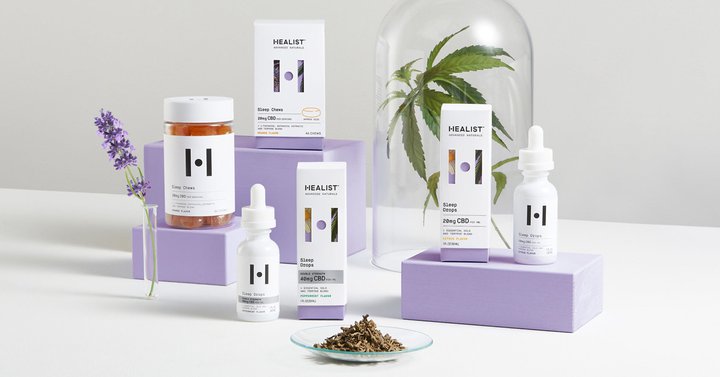
Since becoming legalized in many countries, CBD products have popped up just about everywhere.
From teas to hand creams, you’ll find hemp-based products in just about every health shop, chemist or even supermarket these days.
Several factors have influenced its popularity in recent years, with advocates claiming it can relieve chronic pain and inflammation, depression and insomnia among others.
In fact, a 2017 report by the World Health Organization (WHO) found that CBD could provide relief for a variety of debilitating conditions, including Alzheimer’s disease and multiple sclerosis (MS).
Recent figures by SingleCare show a third of Americans have used CBD at least once or more and of those, the most common uses are for pain relief (64%), anxiety (49%) and insomnia (42%).
But with new CBD brands constantly coming to market and bigger well-established companies jumping on the trend, how can you stand out amongst the noise?
Apart from having a fantastic product, the easiest way to grab a potential customer’s attention is with great packaging.
To show you why it’s so important and give you some inspiration, we want to share some of our favorite CBD oil packaging designs…
Kana Wonders
Designed by real women for women, Kana Wonders is a wellness company that aims to enhance their lives with the power of CBD.
As a start-up, the company was looking for ways to speak directly to their target audience, in a way that was both original and creative.
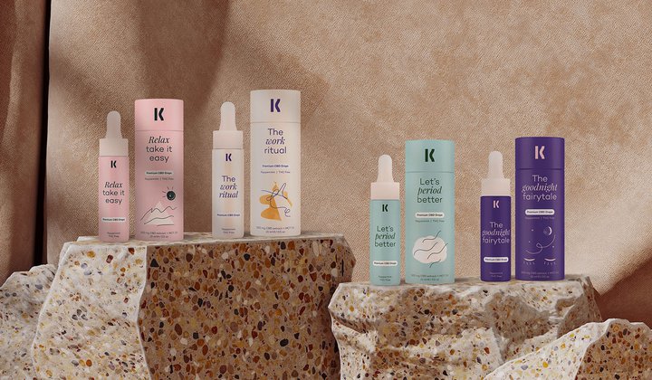
Petya Milusheva approached London-based designer Tsvetan Mitev to help them lay claim to the industry and make a name for themselves as a trusted CBD retailer.
Explaining the inspiration for the brand’s design, Tsvetan said: “As CBD is a fairly new topic and there are a lot of speculations about it. The client and I wanted to soften the understanding of what CBD is by creating an identity that’s light, friendly, natural, feminine and responsible.
“We tried to communicate this by the combination of organic shapes and illustrations, pastel colors, textures, layouts and typography.
“Later on, this conversation evolved in a discovery session with a few exercises which aimed to bring some clarity about possible challenges, target audience, culture and competitors.”
While the client was initially looking for a brand that targets only women, they expressed that at some stage they might expand to offer a men’s range in the future.
This new challenge meant that Tvestan had to come up with some possible solutions.
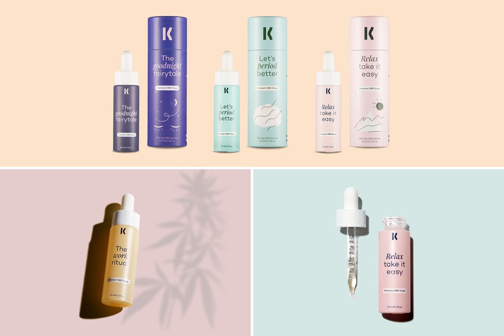
He said: “We decided to have “Kana” as the main brand which expands in two sub-brands ‘Kana Wonders’ and ‘Kana Beast’.
“As a result, we put some extra attention on the type of the logo and the typography, as they had to remain neutral.”
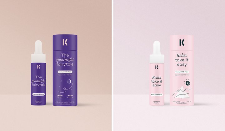
The final designs he came up with are nothing short of contemporary, modern and premium.
Kana’s four different CBD products are set apart by their own unique color palette, but married together with the matching typography and logo.
Tvestan added: “I am proud of the general look and feel we established and how different it is compared to everything else in this niche.”
Kana’s founder Petya said: “As a start-up one of the most important things to succeed is to work with people who have a passion for your mission. I’ve worked with very few people who are willing to go the extra mile and Tsvetan is one of them.
“He raised questions which I didn't ask myself despite having a marketing background. We consider that the input from Tsvetan work on our project is one of the main keys to our success.”
Healist Naturals
Healist Naturals was founded on the belief that “Science Unlocks Nature” - and it was that notion which was at the heart of their ingenious redesign when they approached Robot Food to help them appeal to the masses in an oversaturated market.
The company offers a range of natural active ingredient CBD products including oil drops, chews, patches, and topicals.
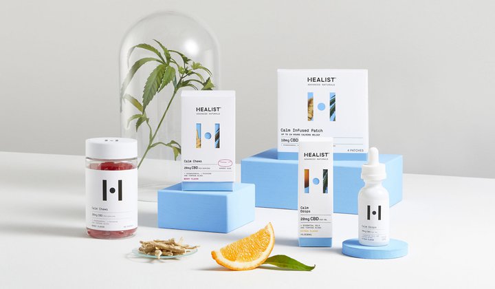
But they wanted to create a brand that could remove the barriers, build trust and bring CBD into the mainstream.
Simon Forster, executive creative director and founder of Robot Food, told Marketing Communications News: “A shift in regulations and consumer mindset have fuelled a sharp growth in the CBD category, so we needed to create a brand with unique cut-through. It was important to remove the typical barriers associated with CBD products, build trust and make it mainstream.”
Steph Oglesby, design director at Robot Food, said: “Most CBD brands focus their approach on the percentage of CBD oil, or align to a specific lifestyle.
The designers said they looked at science and nature as fundamental pillars of the identity and Healist as the sweet spot in between - harnessing the two.
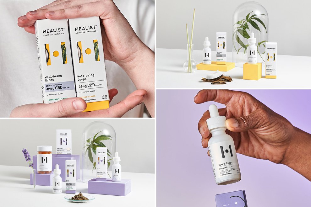
“For the brand to be its most impactful, this balance would have to be represented throughout the visual and verbal identity, starting with the creation of the ‘H’ marque and demonstrated in the reveal of the split packaging,” Robot Food explain on their website.
“In a category of cowboys, we needed to reinforce the efficacy of Healist’s all-natural ingredients.
“From a clean, clinical white as the brand’s primary color to lab inspired iconography and detail, science forms the base of the brand, and is used as a consistent, reassuring structure on which the potential of nature and our bodies can be explored.”
Using science as a base, the designers took inspiration from botanical drawings to come up with Healist’s master illustration style - drawing out each key ingredient across the range.
“We chose to bring nature to life as an adaptable living layer. Every ingredient is carefully considered and chosen for its known benefits – many of which have been around for hundreds if not thousands of years,” the designers said.
The range is made up of four different benefits - sleep, wellbeing, calm and relief - with their own respective color scheme.
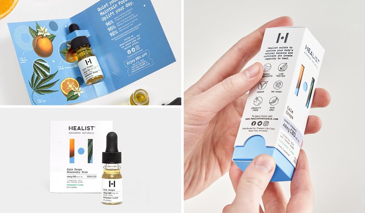
Each box nods to its corresponding benefit in the circular focal point of the H on the front, while the top half slides off to reveal the beautiful pipette glass bottle inside.
Michael Bryce, Healist co-founder and global chief marketing officer, told Packaging of the World: “Working with Robot Food helped us clarify and fully realize our unique market position. As an agency, the team at Robot Food always has front of mind commercial viability as well as strong, engaging design. The brand strategy can flex and grow as we do too.”
Highline Wellness
Nothing says airy and sophisticated quite like a crisp white design.
That’s exactly what designers Unspoken Agreement were asked for in their brief by Highline Wellness who wanted an overhaul of their CBD brand.
The company, based in New York City, gets its name from the 1.45-mile-long linear park which is elevated above the busy Manhattan streets.
On their website, the founders explain: “When you’re on the Highline, you are away from all the chaos and in a little slice of heaven. We want to offer you that feeling, no matter where you are.”
The brand is aimed at the “sophisticated adult” but with the belief that everyone has the right to happiness and wellness, so it’s also affordable too.
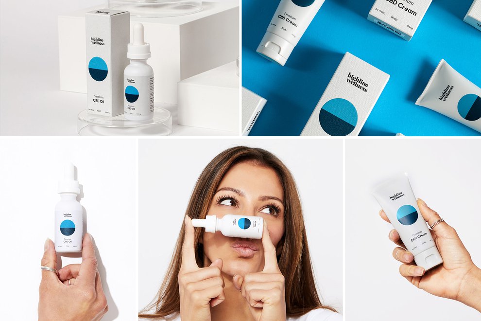
Highline Wellness was reaching a critical juncture and poised for rapid growth when they approached Unspoken Agreement for a brand re-design.
Writing on their website, the designers said: “Our goal was to elevate the company to the next level, while still honoring its customers.
“Inspired by the idea of spirited buoyancy and weightless joy, Unspoken Agreement went about redesigning the brand from the ground up.
“A new, more sophisticated identity; fresh and welcoming brand voice; airier color palette; clean packaging; and a more modern, friendly website.”
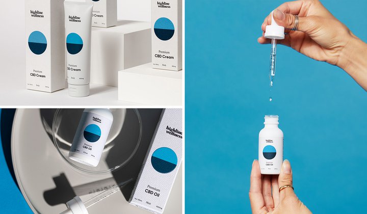
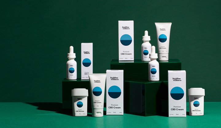
Working with a simple white, blue and green color palette, the designers came up with a fresh and premium new look that oozes the sophistication the team desired.
The packaging uses a minimal design with fun typography that visually represents the calm and peace that Highline Wellness’ CBD products provide.
Hanayu
The founders of start-up company hanayu were looking to find their own balance in life when they developed their CBD oil.
They set out to create a product that wasn’t just something to be associated with recreation and leisure time, rather an item to turn to bring calmness and energy when you need it most.
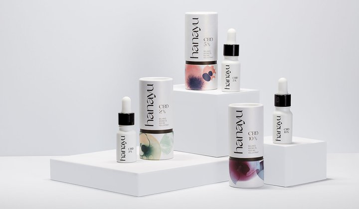
So their branding needed to convey serenity in a world filled with everyday stress.
The German-based team settled for a simplistic yet playful design, with striking watercolor elements to stand out in a busy market.
This photographic style choice creates a visual identity that emphasizes hanayu’s key message of serenity and calmness.
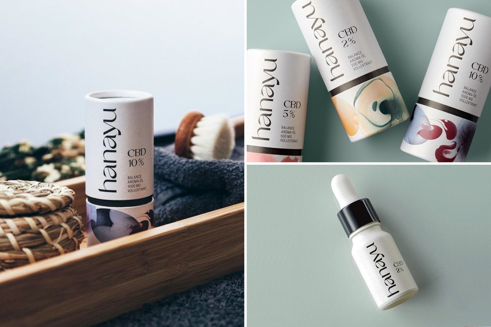
Coupled with an original, serif font, the brand message is consistent across all channels.
But what really helps this impressive brand stand out is the tube-shaped packaging, which opens to reveal the clinical pipette dropper bottle inside.
EIGA Design, which was behind the branding and packaging design process, said on their website: “During the branding process, we enabled the hanayu founders to make their product idea visible and tangible in just a few steps.
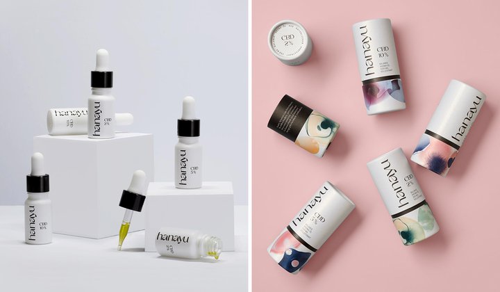
“Together with the EIGA design team, the essential goals for the concept development were defined and tested in design explorations.
“The hanayu brand design uses striking, abstract elements to present the brand messages consistently across all channels while ensuring a clear differentiation from other CBD brands.”
Aire
Weightless, light, airy; that’s how we feel when we’re relaxed.
It’s those sensations that Aire wanted to channel when coming up with the brand and visual identity for their luxury lifestyle CBD brand.
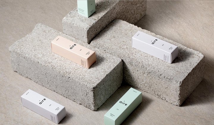
Working with designers OH+CO, they set out to convey a feeling of ease and simplicity while encapsulating a premium feel.
They specifically chose three pastel colors for the product range - a peach, baby blue and mint green - and then introduced a series of more neutral colors to serve as a compliment.
To stand out from other CBD brands, they decided against the cliche of wrapping the bottles in a label and instead constructed bottles made from frosted amber glass with a white screen printed finish.
“The packaging is made of 100% recyclable stock and each product has its own unique pastel color that has been pattern embossed then foiled to give a premium finish,” the designers say on their website.
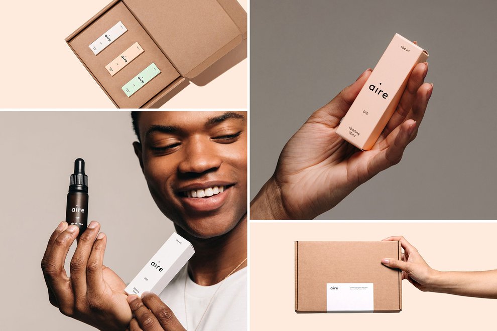
Aire wanted to create a premium aesthetic, so the designers’ art directed a photoshoot with models to “hero the product”, as well as a strapline to embody the brand’s message - “A better way to deal with every day”.
To create a feeling of simplicity, OH+CO also came up with a series of illustrations in a clean, fixed stroke style. These were turned into icons that could be used on both the website and across marketing materials. The designers said:
“The icons were designed with simplicity in mind and a creating harmony with the illustrations and the rest of the brand.”
To marry the brand together, the new designs were also incorporated across the Aire website, along with the model and product photography to really bring the brand to life.
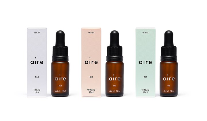
Overall, the design is sleek, authentic and exudes that really high-quality feel Aire was hoping to achieve.
Their aesthetically pleasing CBD oil wouldn’t look out of place on a dressing table next to bottles of expensive perfumes.
What do they have in common?
It’s clear that every one of these brands has come up with their own original and innovative ways to stand out from the crowd.
But there is one thing that they do all share, however; each has a strong brand identity, something which is key to ensuring your product is seen by your target audience.
The simplest way to do that is to take a look at your packaging. It’s one of the first tangible things that your customers will come across, so it needs to speak to them.
Bear in mind that first impressions count - whether that’s in person or virtually - and what your consumer initially sees and feels about your brand can be lasting.
If you need a bit of help when it comes to this area, we have put together a guide on how to build your own brand in eight easy steps.
Once you’ve pulled together a strong brand identity, don’t forget to keep it consistent.
You can see from the examples above that the designers didn’t stop at the packaging or the product. Many of them have been ingenious enough to carry the image across all their platforms - from their online stores to their invoices and delivery notes.
It might seem unnecessary but this level of consistency is easily the best way to become recognizable.
Don’t let little details stop you from being consistent. With Sufio’s beautifully designed invoices that match your brand’s image, you can keep everything looking seamless with minimal effort.
Let Sufio automatically create and send beautiful invoices for your store today.
Professional invoices for Shopify stores
Let Sufio automatically create and send beautiful invoices for every order in your store.
Install Sufio - Automatic Invoices from the Shopify App Store

